10 BEST SS20 MENSWEAR COLLECTIONS
to view collection, click the designer name to launch video and/or gallery
 1. DIOR MEN with kim jones now at the helm, looking back at the history of christian dior, and thinking particularly about the ways that john galliano was able to tap into the archival genius of mr. dior, himself- there is no doubt in any fashion heads mind that, dior as brand aged to 73 years old, has the best archives around. no longer rested in the minimalism or even referred to as ‘dior homme’, jones has allowed the menswear division of the label to take on it’s own respective space, where menswear is hitting hardest. the range of accessories, went all the way off. from the miniature pieces that showcased the dior x rimowa luggage collaboration, to the continued reworking of the iconic saddle bags, this collection was just that a collection. inspired by the art of daniel arsham, the concept of decaying futurism showed itself on the runway with aged letters that of course spelled out, ‘dior’ – as the models walked across pink sand. the most genius thing about this collection were the incorporation of the structural pieces that appeared on the catwalk to what was shown for accessories. it was truly an accentuation of what inspired the collection, even looks that are worn by the artist who inspired the collection made their way in. the lab style coats, and round lensed glasses are almost a uniform for the american artist, arsahm; who shared his creative process across dior’s own official youtube channel. pink was a trend this season, for menswear, but no collection was as thorough, for me, as dior men. my top pick for the season, absolutely, hands down. from last season to this, kim jones proves that he is the front runner for what menswear can be, with absolutely no limitation of greatness.
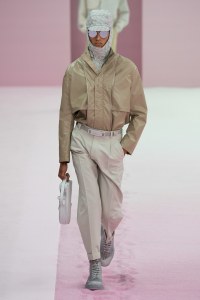
 2. VALENTINO pierpaolo has mastered this way of integrating what has worked well in the market for the house of valetino and keeping it securely into collection elements, while slowly pressurizing the new vibes in a fresh and unsuspecting way. to avoid it feeling jarring, the transition feels natural and paced. when valentino garavani himself exited his namesake label, the house had no allotment of accessories, which many labels rely on for middle market sales. but in the last four years alone, not to mention the womenswear accessories from the red valentino and rockstud collections- the menswear accessories range for the label has since exploded. while the street continues to dominate and influence the catwalk, these designs this season, and ever season really, showcase almost a greatest hits collective. i loved the wearability of the looks, while elevating the simplicity with ways you haven’t seen valentino worn before. there was a focus on t-shirts, and of vital importance, the visibility of the valentino “V” logo worn on many of the looks, accentuated by brash belt buckles. the label, which is among my absolutely favorites, has been doing an amazing job since i last left off reviewing runway. even when not actively reviewing in this space, i have continued watching; and can securely place this collection as number two for the season. pictured in each of the mini-posts for each number in the countdown are my favorite looks, picture is look no. 34- i love the look of functionality. the easy, on the go, almost convertibility of a men’s look is exactly how i dress myself. there was a fresh take on the dad style vacation button down, that added the right touches of vibrance to the collection, without it feeling overpowering.
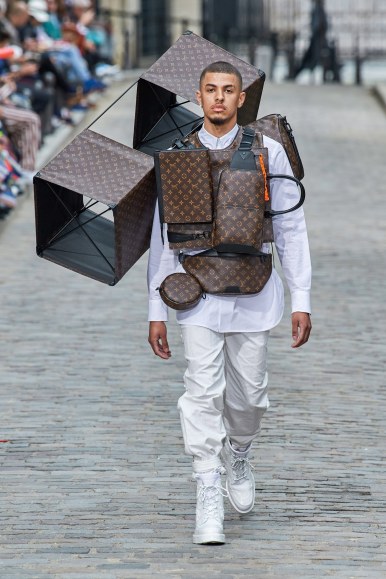 3. LOUIS VUITTON virgil takes flight, breaking the format of design, expectation and shattering the boundaries that had previously existed for casting. artist, delfin, of los angeles, closed the show as athletes, rappers and new faces alike all walked the show. the use of the vuitton monogram is likely the most iconic of fashion, second to only the chanel CC’s- and this season, that was pronounced. the show invites incorporated kites, and the same kite was showcased as the collection clothes, as delfin walked in all white, dropped with a multitude of vuitton men’s bags. the color story was interesting, because it was so far ranging. stoned greys and now-and-later flavored pinks walked in the streets of the runway, which was used as a catwalk. the reinterpretation of the vuitton LV is always so interesting to see, because virgil abloh is an artist himself. pastels and use of florals, in really innovative ways, styled into the bags, and used as print in the collection were all seen. the collection, as it has been since virgil took over the men’s side of vuitton, was a spectacle for the senses. an obviously fire collection, i rate it as third for the season, because the hype clouds the greatness of the clothes, in my mind. a powerhouse of labels, the house of vuitton is solid, but with kim jones at vuitton before abloh, some of these concepts, though inspiring; are not as new as fashion newbies are gassing them up to be.
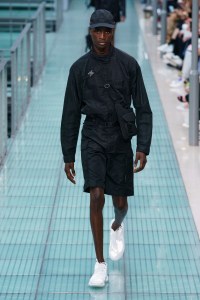 4. ALYX the power is in the details- whether the choice to do chromed out hardware against ice cold blacks- or earthy use of browns and khaki’s with shots of purple- it was all kept clean. a newer label among the collective of my top 10 this season; the line is designed by matthew williams, is based in new york city, and is entirely produced in italy. there’s a militant air to the clothes, and a functionality of modernity that sets the collection apart from others. while the runway show, itself, is more about it’s purpose for wear; the collection may appear flat in stills. with the battle of showmanship for the big fashion houses, i love to look at collections like a guy- thinking of what is best to wear, which details stand out the most and which of the collections is just, simply, good design. pronounced uh-leekz, there was a true fashion aesthetic to the collection that wasn’t over the top or over done. everything was subtle enough, but powerful enough to be noticed. pieces in this collection showcase the same convertibility as others seen in my season’s picks, and could easily be paired together. i am excited to see what ways celebrities will be wearing these pieces, and how they’ll be styled for editorial. with male celebs like, american rappers travis scott and A$AP rocky, british rapper, skepta and neo socialites like luka sabbat being associated with alyx studio; the collaborations that williams has participated in, including moncler and nike only add to his stock, and elevate his cool. alyx is a collection to watch, if you’re not already. and if you’re not already, and haven’t been- catch up, love, you’re already behind.
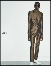 5. TOM FORD always a refinement of american design, tom ford is a true original who sticks to his guns. his collections these days, seem to ride the undercurrent of luxury, and don’t rely on controversy or the validation back by the legacy empire lines like ford’s earlier career did. baring in mind his most poignant design works, at both yves saint laurent and, of course, at gucci. i find it important to balance my season’s picks to both runway and off-runway presentations. tom has always been a favorite of mine, and his influence at those other labels still live there today, and in his own collection, you see the root of those influences. this season’s collection was presented via look book, in an editorial-esque format, which i absolutely loved. the color story was nothing crazy, or even surprising. tom seems to enjoy playing to the etiquette of menswear in all the right ways. the collection is undoubtedly one filled with essentials and male classics. with a more pronounced feel of accessories, the strongest moments were the sleek brown sheen moments throughout. love that, despite all of the trends he’s created throughout his career, he no longer relies on such controversies or spectacles, and instead just keeps his focus on classic elements. theres something subtle and rested about the collection and it’s opted styling notes. the most vibrant, or spring like moments of color are shown at the close, as pink, green and yellow leopard seem intended for the finale, while purple zebra pops in for a moment as well. not my style, but not something new to tom’s stable of style tricks. kept simple, aside from the pops of color; even still, tom ford presents a set of classics that will stand the test of time, after people have forgotten about the animal prints.
 6. VERSACE with excess of their brand DNA, leave it to donatella to continued to keep their legacy aesthetic afloat, with a floral explosion coming out of a ferrari on a rotating platform for the models to walk around during the show. leather trenches, and animal prints- as well as this super interesting two faced design concept that seemed to combine two looks into one. loved that concept the most, even if it was included as a style collision. showing a combined effort of both menswear and womenswear this season, a move that more labels are doing- alyx did the same as well; versace isn’t always my first choice aesthetic for these top ten lists, i admired the set, the casting as most of the choices. there was a punk rock feel, that showcased an array of colors suitable for spring in the collection. the collection seemed to open to more sophisticated choices that were more tame, and as the collection progressed, things got a little more animalistic and radical. the collection closed to a seductive set of leopard prints paired with black leathers, on both men and women; which was all too true to the versace name and legacy. throughout the collection, gianni versace was used on ties, and there was a much more noticeable focus on accessories for men, which has grown with the italian based fashion house, over time. instantly versace recognizable, i liked this collection as pieces, not full looks. felt like combined looks were often too loud, for my own personal taste. but you gotta respect donatello’s approach to stay true to her brother’s house code. the amazing set was a collaboration with artist, andy dixon and the show was soundtracked from start to finish with music by the prodigy.
 7. FENDI a beautiful color story can carry a collection a long way. such was the case with this seasons menswear collection brought forth by the house of fendi. likely the most spring vibed collection of all of the season, inspired throughout by gardening- the set, prints and even the casting seemed to blend seamlessly. beautiful details grounded the collections in a familiar, but fresh type of way. beautiful bags cascaded across the garden where the show was held as a diverse casting of male models glided from one look to the next. while many associate the works of karl lagerfeld with chanel, he worked alongside silvia fendi for longer than he was at chanel. since his death, i have been wondering how or if this would impact the ways that fendi is putting out collections, if it would affect their aesthetic, but it seems it hasn’t or perhaps it’s too early to tell. accessories were a mainstay and headlined for most men’s collections this season, which i loved. the blurred lines of femininity and masculinity were enough to make female consumers just as excited about accessories ranges that were shown. the signature double facing F’s from fendi’s logos were about the only hardware in the collection, outside of buckles on snakeskin loafers. hats looked like bee keeper nexts and geometric patterns and lined prints made their way into the collection on laser cut leather bags, and some of the looks leading to the close of the collection. there was a peaceful nature the collections soundtrack, but as the collection neared it’s finale, it acme more tribal with the intro of more prints. surprisingly, there was more color on the models, and the collection complimented that beautifully. i hope this becomes a mainstay with the fashion house, as it has been a noted absence before.
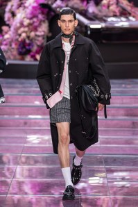
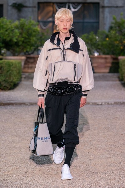 8. GIVENCHY clare waight keller has surprised me. while i am all too well known a fan of givenchy by riccardo ticsi, her choices to maintain and massage have been interesting. classic house code of givenchy dictates a cleanliness unseen by other labels. but there was this urban influence of tisci’s taste that still remains. keller has maintained a balance of old and new, with regard to the the classic. as questionable as it may be to have her add ariana grande as a brand ambassador, (doesn’t matter how pretty you sit little girl, you’ll never be audrey hepburn); the collection shown for men this season included a powerhouse of accessories. accessories being a strength which keller has showcased through past work at other labels, even more with the french fashion house, givenchy has also pronounced and expanded their accessories collections. especially with the range of bags that are offered. there was a delicate inclusion of athleticism that didn’t distract from the collections cleanliness this session, and some polished looks for formal events of the season. neck scarves and bare chests were topped with pastel toned blazers. the use of blue throughout the color palette was done beautifully. easing into the grasp of a major fashion house has been the approach of some, while others like kim jones has taken the more turn-the-house-on-its-head approach. the ease of flow, to slowly start new concepts and keep the more recent and modern, that approach has been carefully planned and executed well. while nothing too exciting was presented, the drama for collections and designers are usually saved for the fall lines. that said, the offering of the season was well received by me, overall a well rounded effort.
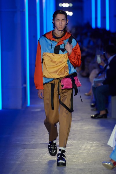 9. PRADA unsuspecting, and true to it’s heritage of stealth luxury; prada i liked. usually, the collections grow on me. then i see how people are wearing the pieces and it takes on a greater form. understated as the house has been, the neonlight lined shanghai setting for the collection was anything but. bold colors created the perfect nod to the spring and summer of 2020, while the classic blacks kept things cool to the touch. i have long loved the nylon accessories collections of prada, and have loved what they’ve created as far as design futurism. again, another collection that included a range of khaki on khaki i love the use of full tonal looks. outside of that, the iconic blowing bag showed it’s familiar faces for the house as eyewear, and sneakers were accented by yellow and pink socks. prada over the season has also diversified their casting, and this season was no different. very happy to see the range of color showcased, in palette and ethnically this season. pants in the collection were cropped but loose, tops were either cut low like a women’s top or buttoned all the way up. berets showed themselves in the collection as well as lab style coats with sharp lines and clean vibes. men’s toiletry bags were held like clutches and that travelers feel from the last few seasons was still hanging around. overall, prada is a label that acts as a gift that keeps on giving. while i ranked it as the 9th best in the collection, it’s treasure-like appeal is one that usually grows on me as we approach the season, or i see editorial representing the lines from a different style angle.
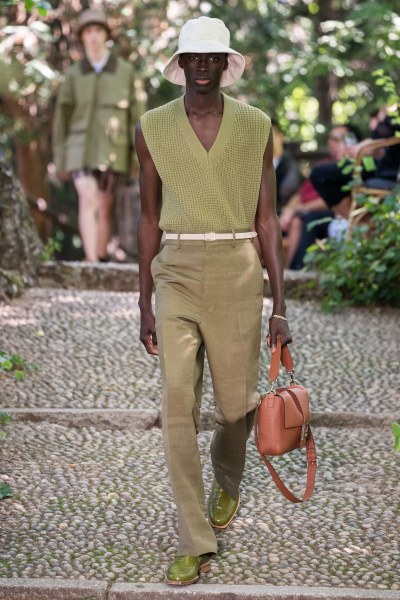
 10. JOSEPH when reviewing menswear, i think of the grounded nature and rules that apply in design. there is a structure that guides menswear, and while fluidity has become injected, if even just to keep things interesting, femininity goes in and out, here and there. as the last collection of the season- i find that the overall vibe was pretty effortless for joseph. soft butter leathers, bucket hats and 90’s nirvana-cobain-esque heathered knits showed throughout the set. off runway, and presented in look book form- i still fuck with a good old studio session to show the clothes. i hate fussy shit, and this collection, i feel; is packed with powerful wardrobe additions that will stand up not only over time, but stylistically as personal choices. and that to me is true style. while other labels and brands in the collection showcase similar concepts, lines and looks- i really liked the collection for it’s simplicity. with the history of joseph existing first as a store, which broke and focused on bringing new and emerging designers to the masses, the label, founded by joseph ettedgui, is one that echoes the same attraction we have to collections by phoebe philo in her beloved céline days, or even in some of the refined ways that prada showcases polish by design. overall, i think wearability is the most crucial part of menswear; with the importance of effortlessness. great use of color, without pushing too hard. the styling was done thoughtfully as well, as you can see any of our wardrobe being elevated by a few pieces in this collection. from fit to concept, and even filler pieces to accent more high powered designs, this collection is the right amount of balance. to close my seasons pick, i think joseph’s offering for the season is the best choice to roundabout my selection.
jeremy’s return to runway review doesn’t stop at menswear
stay tuned through show season as more collection reviews will debut
at the close of each season, in a collective of a top ten, as seen here
for updates down to the minute follow @jeremydante